Most newspaper website redesigns fail before they launch.
Not because the design is bad. But because the publisher is solving the wrong problem.
They hire a designer, pick a theme, and spend three months obsessing over font choices and color palettes. Then they launch a beautiful site that looks great and doesn’t make them any more money than the old one did.
Here’s the truth: newspaper web design is not about aesthetics. It’s about architecture. Specifically, architecture that moves a reader from casual visitor to registered user to paying subscriber.
This guide covers what actually matters when redesigning a news website in 2026 and why the decisions you make before you ever talk to a designer will determine whether your redesign pays for itself.
Why Most News Site Designs Miss the Point
Open up any “news website design inspiration” article and you’ll find gorgeous layouts. Big hero images. Clean typography. Elegant navigation.
What you won’t find: conversion rates. Subscriber numbers. Revenue per visitor.
That’s because the design industry optimizes for visual appeal. Your business needs to optimize for reader revenue.
The publishers running the most successful local news operations aren’t necessarily running the prettiest sites. They’re running sites built around a clear reader journey:
- Reader finds content via Google, social, or word of mouth
- Reader reads one free article
- Reader hits a registration prompt on the second article
- Reader enters their email, joins the newsletter list
- Newsletter drives them back to the site repeatedly
- Repeated exposure to upgrade messaging converts them to paid
Every design decision on your site should serve that journey. If it doesn’t, it’s decoration.
The Three Types of Readers Your Site Needs to Handle
Before any design conversation, you need to understand who is actually landing on your site.
There are three buckets. The first is loyalists who will pay immediately. They love your content, they have the means, and they just need a clear path to subscribe. The second is random traffic that will never convert, for any number of reasons. Don’t design for them.
The third group is where the real opportunity lives: readers who want your content and could become paying subscribers, but aren’t ready yet. They need to be nurtured. The right site architecture does that nurturing automatically, without you lifting a finger after setup.
Your design needs to prioritize capturing that third group into your email list, then letting a well-structured newsletter flywheel do the conversion work over time.
Free Registration: The Most Underused Design Decision in Local News
Most news sites use pop-ups or slide-ins to collect email addresses. They work, but they convert poorly because they interrupt the reading experience and ask for something before delivering value.
A better approach is free registration tied directly to content access. Give the first article away completely free with no friction. On the second article, present a registration prompt that emphasizes continued free access, not a newsletter sign-up.
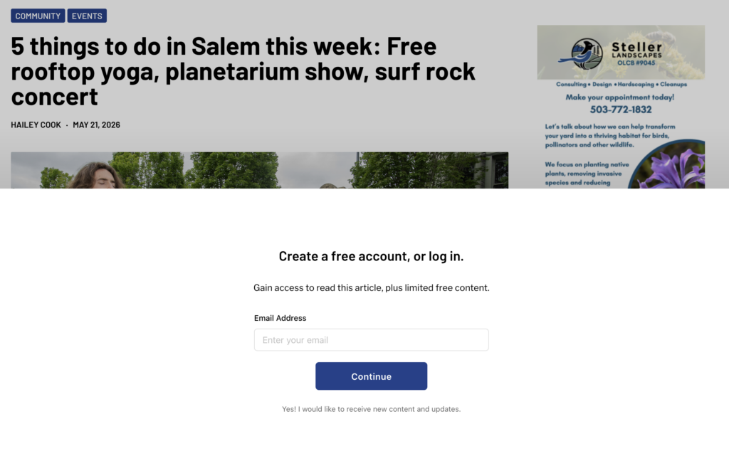
The framing matters. You are not asking readers to join a mailing list. You are offering them continued access to content they have already shown interest in. They enter an email and create a password. That is the entire ask.
Publishers using this method see email lists grow roughly 20% faster than those relying on traditional newsletter sign-up methods. The registered readers are also higher quality. They chose a password. They are logged in. You can track exactly which articles converted them.
This registration gate is a design decision, not a marketing decision. Where it appears, how it looks, what it says, and how frictionless the flow feels are all determined at the design stage. Getting it right at launch is far easier than retrofitting it later.
The Two-Newsletter System and Why Your Site Design Enables It
Once free registration is in place, you have two distinct audiences: free registered readers and paid subscribers. Each needs a different newsletter, and your site design needs to support both.
The free newsletter’s job is to drive traffic back to your site and present upgrade messaging. Include an upgrade prompt near the top and a more detailed promotion at the bottom. Readers who scroll to the bottom of a newsletter are highly engaged and are exactly the people most likely to convert.
The paid newsletter removes that upgrade messaging entirely. It may also offer additional perks: early delivery, a dedicated afternoon edition, or full-text articles that don’t require clicking through to the site.
The flywheel this creates is self-reinforcing. Casual readers arrive on your site, register, join your newsletter, get driven back to your site regularly, see upgrade messaging repeatedly, and eventually convert. The more touchpoints in the cycle, the higher the conversion rate compounds over time.
This is why your site architecture and your newsletter strategy are not separate decisions. They are the same decision, made together at the design stage.
Send Frequency: The Design Implication Nobody Talks About
Most publishers send newsletters too infrequently, and the data on this is stark. Comparing two similar regional news publishers, the one sending more frequently outperformed the other by roughly 4x in paid conversions. The primary difference was email cadence.
For news publishers, the minimum should be one daily newsletter. For magazine and long-form publishers, twice weekly at a minimum.
The fear of annoying readers is usually unfounded. These are people who opted in with an email and a password. They want your content. Even if they only engage with 20% of your sends, that engagement compounds. Each send is another opportunity to click through, land on your site, and see an upgrade prompt.
The design implication: your site needs to be built to support high-frequency publishing without falling apart. Fast load times, clean article templates, and a frictionless reading experience matter more when readers are visiting daily than when they visit once a month.
What Good Newspaper Website Design Actually Looks Like
With that revenue architecture in mind, here is what the design decisions that actually matter look like in practice.
Mobile-First, Always
Over 70% of local news readers consume content on mobile devices. If your site is not designed mobile-first (not just “mobile responsive,” but genuinely optimized for the thumb-scroll reading experience) you are losing readers before they ever have a chance to convert.
Fast load times under 3 seconds, readable text without pinching, tap targets that work reliably, and a registration or newsletter CTA visible without scrolling are table stakes.
Article Pages Are Your Most Valuable Real Estate
Your homepage gets a fraction of the traffic your article pages do. Most readers arrive via search or social and land directly on a story. They never see your homepage at all.
Your article page template is the most important design decision you will make. It needs to load fast, present the registration or paywall prompt at the right moment, offer a newsletter signup for readers who are not ready to register, and surface related content to keep engaged readers on the site.
Many publishers spend weeks on homepage design and thirty minutes on article page design. That is backwards.
The Registration and Subscription Prompt Are Design Problems
A poorly designed registration prompt, one that feels intrusive or untrustworthy, will suppress your list growth no matter how good your content is. A poorly designed subscription prompt will suppress your paid conversions regardless of your pricing.
Both need to communicate value clearly, build trust quickly, and make the next step feel easy and obvious. These are conversion design problems as much as they are content problems, and they deserve serious design attention.
Speed Is Not Optional
Google’s Core Web Vitals are a ranking factor. More importantly, a slow site kills conversions and undermines the newsletter flywheel. Every additional second of load time reduces the probability that a reader stays, engages, registers, and eventually pays.
A redesign is the right moment to fix your infrastructure: not just visually, but technically.
WordPress: The Right Foundation for Local News
For small to mid-size local news operations, WordPress remains the best publishing platform. It supports complex paywall and registration logic, has the largest ecosystem of news-specific themes and plugins, and can be managed without a full-time developer once set up correctly.
The key is choosing tools that work together, not stitching together twelve separate plugins that each solve one problem and create three new ones. Your registration system, paywall, newsletter platform, and analytics need to be designed as a unified stack from day one.
The Mistake That Costs Publishers the Most
A publisher invests $5,000-$15,000 in a beautiful new website, launches it, and then tries to figure out monetization later. We see this constantly.
Monetization added after the fact is always harder, more expensive, and less effective than monetization built in from the start. The registration prompt feels bolted on. The newsletter integration is clunky. The paywall logic conflicts with the SEO structure. Six months later there is another partial redesign.
The publishers who grow fastest treat the revenue architecture and the site design as a single problem. Because they are.
What a Modern News Website Redesign Should Include
Registration and subscription infrastructure
- Free registration gate set to trigger on the second article
- Metered or hard paywall with configurable rules
- Stripe-integrated checkout with minimal friction
- Subscriber management and self-service account portal
Newsletter system
- Two-list segmentation: free registered readers and paid subscribers
- Upgrade messaging built into the free newsletter template
- Automated welcome sequences for new registrants
- Support for daily send frequency without technical friction
SEO fundamentals
- Clean URL structure
- Schema markup for news content
- Fast load times and passing Core Web Vitals
- XML sitemaps and Google News compatibility
Analytics and conversion tracking
- Registration funnel visibility by article and source
- Newsletter open and click-through rates by segment
- Subscription conversion tracking tied to newsletter touchpoints
The Bottom Line
A great newspaper website design is not the one that wins design awards. It is the one that captures the most readers into your email list, drives them back to your site repeatedly, and converts them into paying subscribers over time.
The visual design matters. A site that looks trustworthy and professional signals credibility to readers and advertisers alike. But it is in service of the revenue architecture underneath.
If you are a local news publisher planning a redesign, start with the revenue question: how will this site capture readers, nurture them, and convert them? Then build the design around the answer.
PaywallProject is a fully managed platform for local news publishers. We handle the website, the paywall, the newsletter infrastructure, and the subscription management, so you can focus on the journalism. Learn more about how we work.